Data Diving - expert-depth data analysis report
"# Data Analysis
Five publication-grade report styles. Three-layer insight on every finding. The kind of analysis your data deserves — not a chart dump, a structured case with causes and calls.
#What you will get
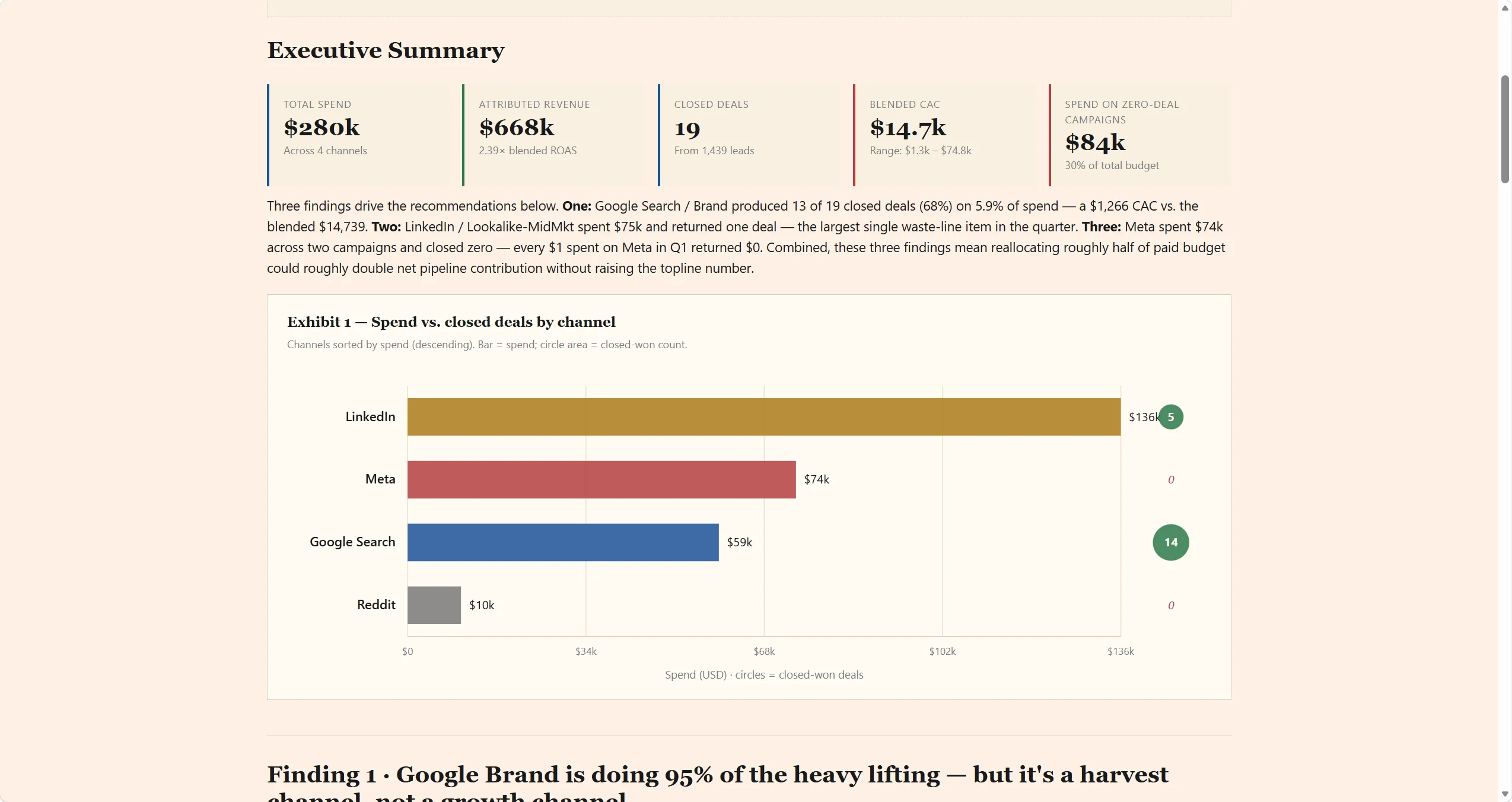
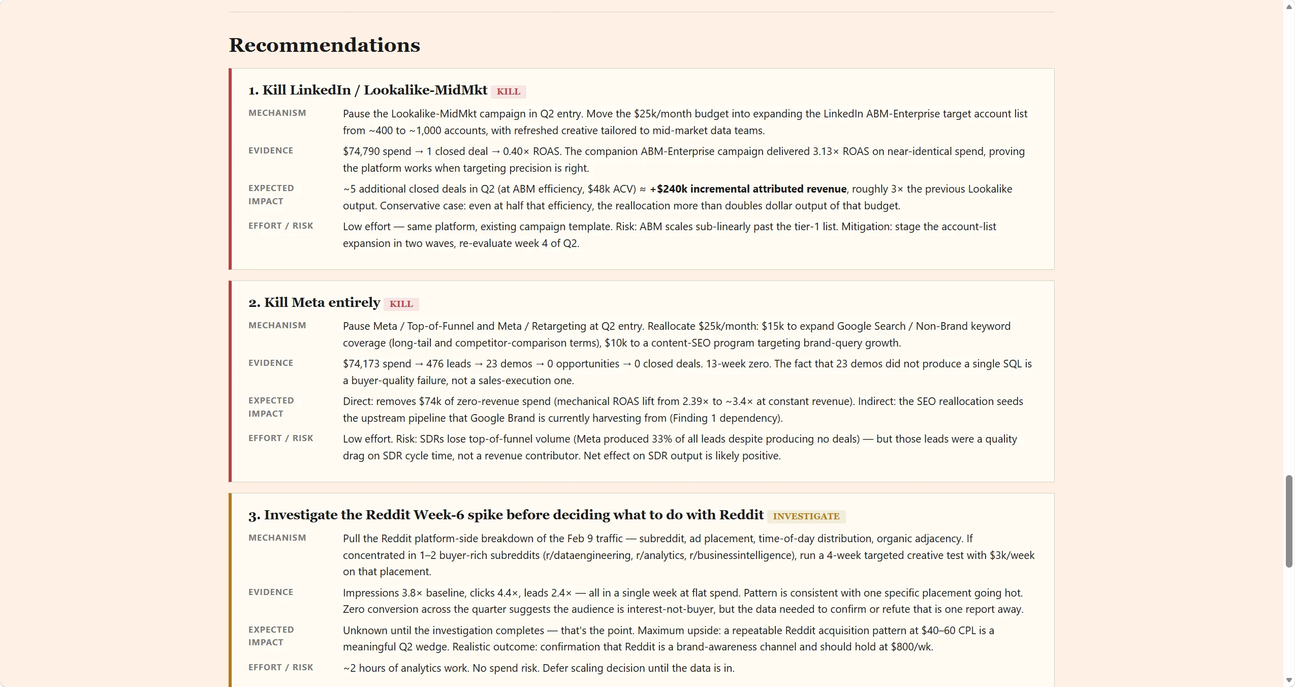
Input your raw data file and you will get a structured data analysis report like this: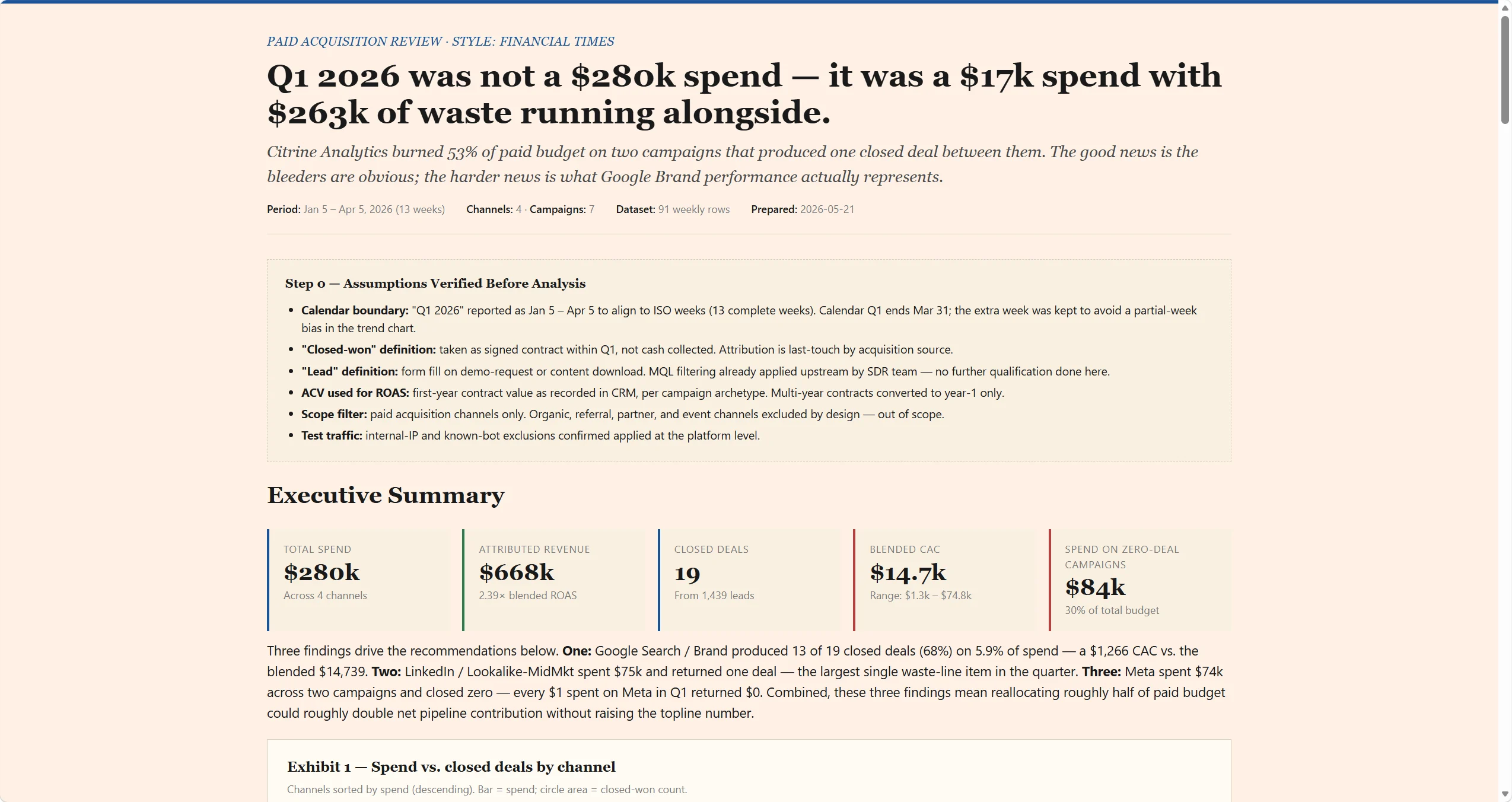
When to Use / Best For
- You need a report that looks like it came from a strategy firm: five editorial
styles — Financial Times, McKinsey Consulting, The Economist, Goldman Sachs, Swiss/NZZ
— each a complete design language with defined color systems, typography, and layout
rules. Not a template skin; a publication standard. - Your data has a pattern you can see but can't explain: the three-layer protocol
forces every observation through WHAT → WHY → So What. The skill won't let analysis
stop at ""revenue dropped"" — it has to surface a hypothesis for why, and a decision for
what to do. - You're delivering findings to decision-makers: report structure is conclusion-first
by default — the answer in the first three lines, data and evidence in the body. Built
for people who scan, not read. - Full-stack coverage without coordinating multiple tools: Excel analysis → insight
narrative → HTML interactive report → PPTX slides. Brief once, get the whole stack.
How It Works
Five editorial report styles — rendered with ECharts, not screenshots:
| Style | Signature | Best for |
|---|---|---|
| Financial Times | Salmon-pink ground, serif analysis titles, 4px blue top bar | Financial analysis, narrative reports |
| McKinsey Consulting | Navy header, Exhibit numbering, conclusion-as-title | Strategic analysis, framework decks |
| The Economist | Red thin bar, editorial density, magazine rhythm | Industry insight, opinion pieces |
| Goldman Sachs | Rating badges, gold accent, dense data tables | Financial modeling, valuation reports |
| Swiss / NZZ | Black-white-gray-red, 72px display type, extreme contrast | Data showcase, design-driven reports |
Style randomly rotated per deliverable unless specified — so a weekly report series
doesn't look copy-pasted.
Three-layer analysis — non-negotiable on every finding:
Every major observation must reach WHY (what mechanism explains it). Every top-three
finding must reach So What (what decision it supports, with mechanism + evidence +
expected impact + effort). Reports that stop at Layer 1 (description) are flagged
as incomplete before they ship.
Pre-analysis assumption check: Before running any numbers, the skill surfaces
assumptions that, if wrong, corrupt the entire analysis — fiscal period boundaries,
business definitions (""active user"" = login-based or action-based?), GMV scope, data
lineage. Verified first, not discovered mid-report.
Chart rendering that doesn't break: All chart coordinates are computed from data
arrays via ECharts or D3 scale functions — never hardcoded pixel positions. Bar-chart
Y-axes start at zero. Stacked segments under 3% consolidate to ""Other."" SVG annotations
stay inside the viewBox. What you see in preview is what gets delivered.
Why This Skill / What Makes It Different
vs. BI dashboards (Tableau, Power BI, Looker): BI tools visualize the metrics you
configure. This skill reads the data cold — identifies which segments behave differently,
writes the hypothesis for each pattern, and produces a narrative the dashboard can't.
vs. ChatGPT or generic analysis prompts: No enforced depth — ChatGPT will summarize
Layer 1 and call it analysis. The three-layer protocol here is structural: Layer 2
(hypothesis) is required on every finding; Layer 3 (decision) is required on the top
three. Recommendations without mechanism and evidence don't ship.
vs. commissioning a report from a freelancer: Five editorial styles at publication
quality, data-driven charts that update cleanly when the data changes, and a structured
insight framework — delivered in the same session as the data upload.
Warm professionalism by design: The visual system avoids cyber-neon and dark
backgrounds in favor of warm palettes (cream, coral, dark gold) that read as
professional-yet-human — designed for projectors and client presentations, not
just screens."