

Frontend Design Direction - Free Claude Skill
Frontend Design Direction
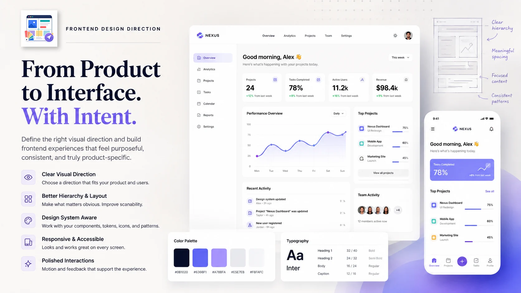
A frontend can work perfectly and still feel wrong.
Maybe the hierarchy is flat. The spacing feels arbitrary. Everything is inside a card. The hero is huge, but the actual product is buried below it. Or the whole interface looks like the same generic AI-generated landing page you've seen dozens of times.
Frontend Design Direction helps fix that.
Give it a website, dashboard, app, component, landing page, or existing frontend project. It helps decide what the interface should feel like, then carries that direction into the actual design and implementation.
Start with the product, not the decoration
Before changing colors or adding animations, the skill looks at what the interface is actually for.
It considers:
- What job the product needs to do
- Who will use it
- What users need to notice first
- How often they will use the interface
- What tone fits the product
- What technical and design constraints already exist
A dashboard used eight hours a day should not be designed like a launch page.
A portfolio does not need to look like an enterprise admin panel.
A visual creative tool may need more personality than a financial operations interface.
The design direction follows the product instead of forcing every project into the same template.
Choose a clear visual direction
The skill can help define a specific direction before implementation begins.
That might be:
Dense, quiet, and highly scannable.
Editorial and refined with strong typography.
Technical and utilitarian.
Playful and expressive.
Minimal, calm, and product-focused.
Bold and visual without becoming difficult to use.
The point is to make deliberate choices rather than combining random design trends.
It also looks for one memorable detail that gives the interface some identity without turning the entire page into decoration.
Improve visual hierarchy
Good interfaces make it obvious what matters.
Frontend Design Direction can rethink:
- Information hierarchy
- Page structure
- Typography
- Spacing
- Alignment
- Content density
- Navigation
- Primary and secondary actions
- Visual grouping
- Empty space
This is especially useful when a page technically contains all the right information but still feels difficult to scan.
The goal is not to make everything larger.
Sometimes the right fix is smaller text, tighter spacing, fewer containers, or putting the actual product higher on the page.
Work with the existing design system
If the project already has components, tokens, icons, routing patterns, or a visual language, the skill uses those first.
It does not automatically introduce a new design system just because another style might look interesting.
Existing:
- Components
- CSS variables
- Design tokens
- Icon libraries
- Layout conventions
- Navigation patterns
- Framework conventions
can all be reused and refined.
That makes the result easier to maintain and less likely to feel disconnected from the rest of the product.
Avoid generic AI-designed UI
A lot of generated frontend work falls into the same patterns:
- Huge vague hero copy
- Purple gradients everywhere
- Decorative glowing blobs
- Oversized rounded cards
- Cards nested inside more cards
- Random glassmorphism
- Too much empty space
- Marketing sections hiding the actual product
- Decorative animation that does not help the user
- One accent color repeated across the entire interface
Frontend Design Direction actively pushes against those defaults.
If the product is a tool, the tool should usually be visible.
If a control already explains itself, the interface does not need a paragraph describing what the control does.
If a simple layout works better, it should stay simple.
Design for the actual workflow
For applications and dashboards, the skill focuses on repeated use rather than first-impression marketing.
That can mean making:
- Important information easier to scan
- Toolbars more stable
- Controls easier to reach
- Dense data easier to compare
- Repeated actions faster
- Status and hierarchy clearer
- Navigation less distracting
The first screen should communicate what the product actually does rather than making users scroll through generic marketing content before reaching it.
Typography that fits the interface
Typography is treated as part of the layout, not something added afterward.
The skill considers:
- Font size
- Weight
- Line length
- Label density
- Heading hierarchy
- Wrapping behavior
- Container width
- Mobile readability
It avoids oversized typography when the interface does not have space for it.
Long labels should wrap or resize cleanly instead of pushing neighboring elements out of place.
Better use of color
Color should create hierarchy and meaning rather than tint the whole product the same shade.
The skill can help build a palette with enough range to distinguish:
- Backgrounds
- Surfaces
- Primary actions
- Secondary actions
- Borders
- Status states
- Data visualization
- Interactive states
It also checks contrast and makes sure the palette still works when the interface becomes dense.
Motion with a reason
Animation is useful when it explains what changed.
It is less useful when everything moves simply because it can.
Frontend Design Direction favors motion for things like:
- State changes
- Opening and closing panels
- Navigation transitions
- Selection feedback
- Reordering
- Progress
- Revealing context
Decorative animation should stay secondary to usability.
Responsive by design
Desktop-first layouts often break when they are simply squeezed onto a smaller screen.
The skill considers responsive behavior while designing the interface:
- Grid changes
- Stable toolbars
- Minimum and maximum widths
- Card and tile sizing
- Image aspect ratios
- Control placement
- Label wrapping
- Mobile navigation
- Content priority
The result should still make sense when space becomes limited.
Use real visual content when it matters
Some interfaces depend heavily on what they display.
A travel product needs places.
An ecommerce product needs products.
A game interface needs gameplay.
A media tool needs inspectable media.
A dashboard may need real charts and data.
When visuals carry the meaning of the product, the skill treats them as part of the design instead of filling the space with generic placeholders.
Use it for
Frontend Design Direction works well when you want to:
- Design a new website or web app
- Improve an existing frontend
- Redesign a dashboard
- Build a landing page
- Design a product interface
- Improve an individual component
- Fix weak visual hierarchy
- Make a UI feel less generic
- Adapt a design to a specific audience
- Improve responsive behavior
- Bring consistency to an existing project
It can work from a written brief, existing codebase, screenshot, rough layout, or partially finished interface.
Example requests
Redesign this dashboard. It works, but everything has the same visual weight and it is hard to scan.
Build a landing page for this developer tool. Keep the product visible above the fold and avoid generic SaaS design patterns.
Improve this settings page without changing the existing component library.
Make this interface feel more editorial and premium while keeping it easy to use.
Review my current frontend and identify what makes it look AI-generated or templated.
Design the mobile version of this desktop dashboard without losing the information hierarchy.
What you get
Depending on the task, the skill can help produce or improve:
- Visual direction
- Page structure
- Layout
- Typography
- Color system
- Component hierarchy
- Interaction patterns
- Responsive behavior
- Motion
- Production frontend code
The result should feel appropriate to the product, not simply more decorated.
Source
Frontend Design Direction comes from affaan-m's ECC project. It preserves community design-direction guidance originally contributed by linus707.
Source:
https://github.com/affaan-m/ECC/tree/main/skills/frontend-design-direction


