Editorial Infographic Director
Editorial Infographic Director
Turn complex information into visual stories people can understand, explore and remember.
Transform notes, datasets, research and technical processes into editorial infographics with a clear message, deliberate composition and carefully structured evidence.
Editorial Infographic Director brings together information architecture, art direction, data visualization, illustration and production review. It defines the story first, then builds the grid, typography, palette and visual language around it.
Use it to create a new infographic, improve an existing one, or develop a detailed specification for production.
What you can create
- Editorial infographics: explain complex topics through a strong headline, a dominant visual and structured supporting information.
- Isometric landscapes: make environments, ecosystems and operational spaces easier to explore.
- Anatomy and cutaway illustrations: reveal how the parts of an object, space or system relate.
- Data stories: turn numbers into meaningful comparisons with proportional charts, direct labels and clear sources.
- Technical process flows: communicate stages, ownership, decisions, dependencies and exceptions.
- Social posters and carousels: adapt research and reports into focused visual narratives.
- Design critiques: identify the highest-impact improvements to hierarchy, composition, typography and data integrity.
Showcase: three example results
These examples were created for this showcase. The illustrated environments are concept studies, and the numerical example uses explicitly synthetic data.
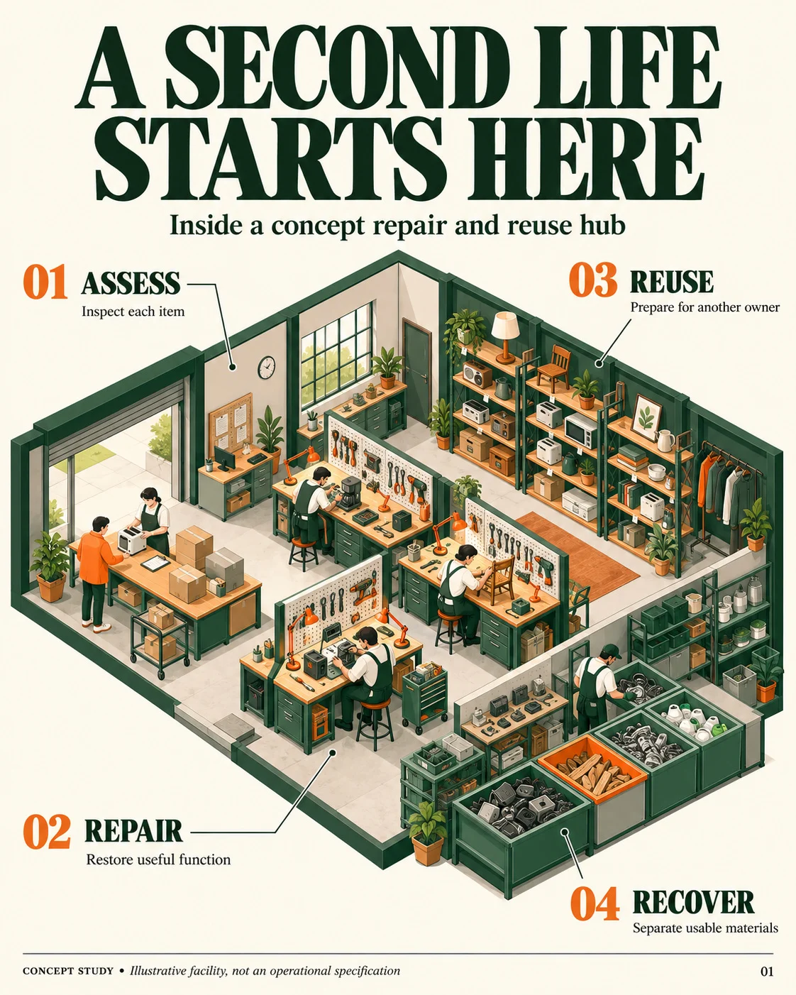
01 — A second life starts here
Example input
Create an editorial infographic showing an imagined repair and reuse hub. Organize the space around assessment, repair, reuse and material recovery. Use an isometric illustration, a warm background, forest green and orange, and short English labels.
Result
A single illustrated environment brings four activities into one coherent scene. A dominant headline establishes the subject, while numbered labels introduce the main functions without long explanatory paragraphs.
Capabilities demonstrated
- Isometric spatial storytelling
- Integration of illustration and information
- Restrained palette and strong typographic hierarchy
- Short, direct annotations
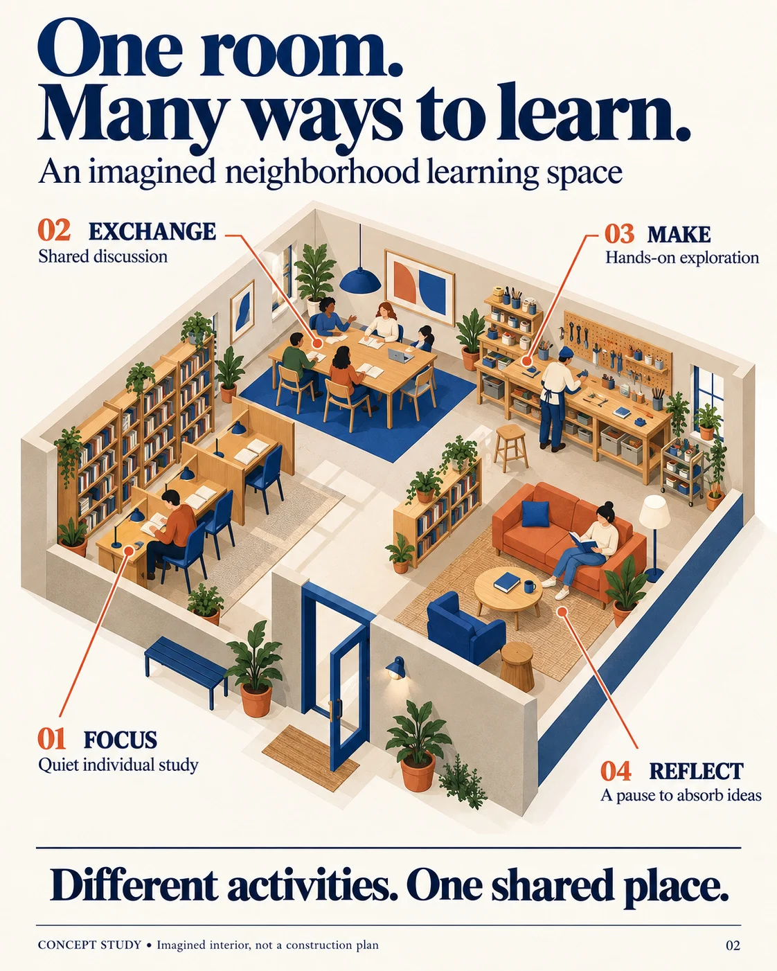
02 — One room. Many ways to learn.
Example input
Design a cutaway infographic of an imagined neighborhood learning space. Show four activities: individual study, shared discussion, hands-on exploration and reflection. Use a large central illustration with direct callouts.
Result
An architectural cutaway makes the interior visible and connects each activity to its location. The composition combines a large hero illustration with clear labels and a concise closing message.
Capabilities demonstrated
- Cutaway composition
- Spatial organization of related ideas
- Numbered callouts and contextual detail
- A visual language adapted to an educational subject
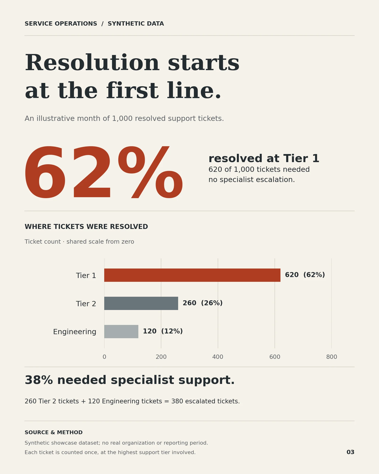
03 — Resolution starts at the first line.
Example input
Create an editorial data poster using this synthetic support dataset: 1,000 resolved tickets; 620 resolved at Tier 1, 260 at Tier 2 and 120 with Engineering involvement. Count each ticket once at the highest support tier involved. Highlight the main finding and clearly identify the data as synthetic.
Result
A prominent 62% establishes the principal finding. A directly labeled bar chart compares the three groups on a shared scale starting at zero. A secondary takeaway explains that 38% required specialist support, with the calculation and methodology included.
The chart was generated programmatically to preserve exact values and proportional bar lengths.
Capabilities demonstrated
- Selection of an editorial takeaway
- Accurate chart construction
- Consistent counts, percentages and denominators
- Visible source and methodology notes
How it works
- Clarify the story. Identify the audience, objective, main conclusion, supporting evidence and missing information.
- Build the structure. Choose a narrative, establish the reading order and organize the content on a shared grid.
- Design the visual system. Define typography, semantic colors, illustration style, chart encoding and annotation rules.
- Produce and review. Use the appropriate tools, check the result and correct issues that affect comprehension or accuracy.
The design aims to work at three reading distances: a clear takeaway at first glance, recognizable sections during scanning, and supporting detail on closer inspection.
The right production method for the content
| Approach | Best suited to |
|---|---|
| Image generation | Illustrated concepts, isometric environments and cutaways with short copy |
| Editable composition | Exact labels, dense text, localization and outputs that need future updates |
| Code-generated visualization | Charts requiring faithful scales, proportions, comparisons and numeric labels |
| Hybrid production | Generated illustration combined with editable typography and programmatic charts |
Execution depends on the tools available in your environment. The skill provides the editorial method and production instructions; it does not install image-generation tools, design applications or integrations.
When suitable tools are available, it can produce the artifact directly. Otherwise, it provides a specification and prompt or build plan for the next production step.
What you receive
Depending on your request:
- A one-sentence editorial thesis
- A chosen visual archetype and content architecture
- Layout, typography and palette specifications
- Illustration, chart and annotation rules
- A production-ready prompt or editable-artifact instructions
- The generated artifact, when supported
- A QA report identifying checks, defects and corrections
If you request only the final image, the planning can remain behind the scenes.
Built-in editorial review
The skill uses a 30-item quality scorecard covering:
- Story and hierarchy
- Grid and composition
- Typography and copy
- Data and meaning
- Visual consistency
- Production integrity
Its target is 52/60, with no blocking defects in critical areas such as legibility, data accuracy, source treatment and output dimensions.
The scorecard is an internal review framework, not an independent certification. Unverified checks and remaining limitations should be stated explicitly.
Useful applications
- Explain an AI architecture or operational workflow.
- Turn a research report into a visual summary.
- Present a dataset as an editorial data story.
- Create an educational anatomy or cutaway graphic.
- Develop a branded report illustration.
- Adapt one narrative into a poster or carousel.
- Review an existing infographic and produce a concrete redesign plan.
Start with this brief
Create an editorial infographic about [topic].
Audience: [Who will read it?]
Objective: [What should they understand or do?]
Main takeaway: [The single most important message]
Content and sources: [Paste the facts, data or approved copy]
Format: [Poster, carousel, editorial page, technical screen, etc.]
Brand constraints: [Colors, available fonts, assets or guidelines]
Output: [Final image, editable artifact, design specification or critique]
Provide whatever you already have. The skill uses reasonable defaults and asks for clarification when a missing detail materially affects the result.
FAQ
Can it generate the final infographic?
Yes, when the required production tools are available. Otherwise, it provides a detailed design specification and an executable prompt or build plan.
Can I use my own data and brand?
Yes. Supply your data, approved copy, brand colors and available fonts. Missing information should be flagged rather than silently invented.
How does it handle exact text and numbers?
Text-critical work is routed toward editable typesetting, and numerical charts toward programmatic construction. Generated text requires inspection before publication.
Can it improve an infographic I already have?
Yes. Critique mode prioritizes three high-impact corrections, proposes a revised structure and evaluates the current and proposed designs. A proposed score remains provisional until the redesign is produced and inspected.
Does it support accessible design?
It targets readable typography, sufficient contrast, direct labeling and meaning that does not depend on color alone. Full accessibility also depends on the delivery format, including text alternatives and reading order.
Can it work in other languages?
Yes. Specify the language of the final copy and any terminology that must remain unchanged.
What is outside its scope?
Ordinary slide decks, conventional dashboards, logos and decorative illustrations without an information-design objective. It is designed to develop original compositions from your content rather than reproduce a specific published infographic.